Pay Your Selfie
Mobile App
2016
OUTPUTS: Mobile Interface, UI Kit, Prototype
TOOLS: Sketch, InVision
ROLE: UI Designer, UX Writer

Overview
Pay Your Selfie is a fun easy way for users to make extra money by snapping selfies with their favorite products; meanwhile providing brands with unique advertising opportunities and an authentic way to collect user insights.
The product was struggling to appeal to its target users and felt the user interface might be steering potential users away from adopting. They have a high engagement rate from 30 to 40 somethings and 78% of their audience is female. They would like to find a way to reach a broader audience—specifically users age 20 to 35—and explore ways they might engage more male users.
The Problem
Pay Your Selfie needs a new user interface for their app that communicates transparency & trust while maintaining a sense of playfulness and simplicity so that users will feel their privacy and information is secure to increase quality engagement and product adoption.

UX Synthesis
We began work on Pay Your Selfie by sifting through the research and user testing conducted by our UX team. The key insights uncovered by their work were invaluable to creating a user-centered product and I knew how imperative they would be to implement in designing the user interface.
Building upon the user experience research, we conducted a 20-second test exploring various visual elements and styles with stakeholders to get a better feel for what our clients were looking for and align on a broad vision for the evolution of the Pay Your Selfie App.

Visual Identity
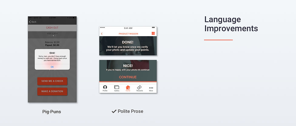
THE PROBLEM WITH THE PIG
It was instantly apparent that some key aesthetic elements were scaring users away. Having communicated with the UX team about the work they did on the app, I knew that swaying our stakeholders away from their beloved piggy bank logo wouldn’t be easy. They’d already invested quite a bit of time and money into marketing the pig image and the slightly off-putting color scheme. They felt very strongly that the red pig logo differentiated them from the competition.
I kept this in mind when conceptualizing and designing my mood boards and style tiles by toning down the loud red and orange palette; finding ways to use it in more subtle ways throughout while combining them with complementary colors. In some of the styles, I integrated a bright green to help the user identify Pay Your Selfie with financial/banking focused apps and money to spur a feeling of trust and security. In another style, I integrated a light blue to invoke a feeling of friendliness, comfort, and familiarity.
By the second meeting, however, it was apparent that the pig was here to stay; as was the bright orange. My second iteration ultimately ended up looking nothing like my initial concepts but still kept the same principles in mind. I pieced these together with several insights I made after completing the style tiles/initial concepts. These helped shape the new visual and verbal language of the product.
Key Insights & Improvements
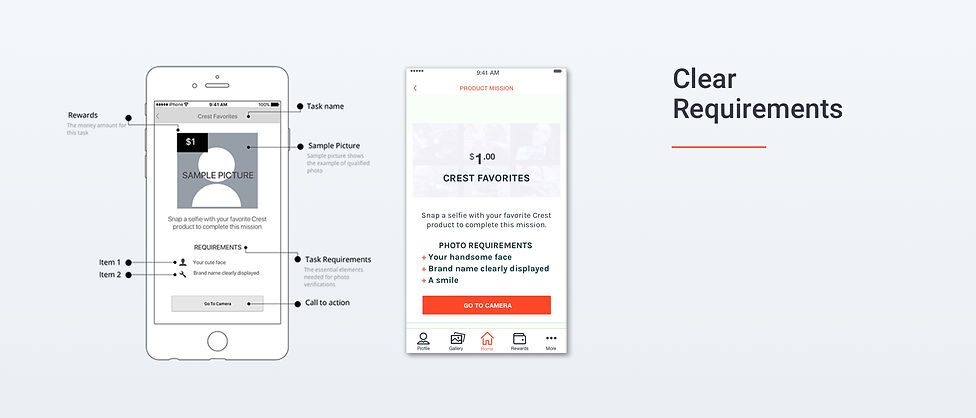
Product Mission vs. Product Task: Work vs. Leisure
Clearly displayed polite instructions
Transparent overlay with retracting arrow button